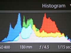
What better way than to analyze some of the pictures and their histograms? Just for this experiment I took various shots (and some from my old trips) to demonstrate the corresponding histograms. By the way, this is second part of the series on histogram. Check out Part I for some basic understanding of what a histogram actually is and why is it important to know what the histogram shows.
-
Underexposed Image
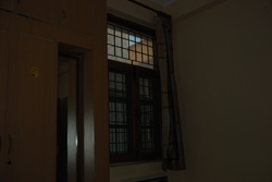
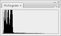
The following image is underexposed. It’s dark in color and all the details in the dark areas have been lost. The curve in the histogram is shifted to the left which means overall there are more dark areas than the bright ones.
-
Overexposed Shot
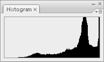
The following image is overexposed. It’s bright and all the details in the bright areas have been lost. The curve in the histogram is shifted to the right and cut off at the right end — to show that the histogram is leaning more towards the highlights.

-
Low Contrast Scene
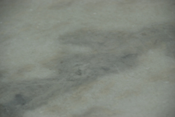
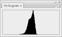
This image has a very low contrast. If you can recognize it, it is a marble stone. This results in a very limited range of mid-tones and thus the histogram curve is concentrated to the center.
-
High Contrast Scene
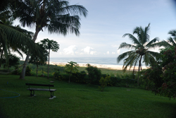
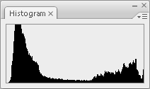
This image has a high contrast. The areas in the image range from the darkest to the brightest and eventually cut off at the end. Here’s where you can’t do much other than try flash fill to expose the dark areas. The other way is to use bracketing and create an HDR image.
-
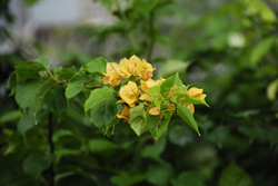
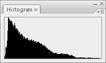
Balanced Histogram
This scene is balanced. The histogram covers all the dark areas to the lighter ones bringing out detail throughout the range of exposure. The curve is quite centered to the left side since there are no bright areas in the image. An ideal histogram looks more or less like this and mostly the curve forms in the central part.
The next time you see a histogram you will know if you increase the exposure to get the curve towards the center or if you need to underexpose to shift it right. This is where the levels and curves in your image editor comes in handy; to fine-tune the exposure. Hope you find this information useful. If you have any thoughts about this they are welcome in the comments.


Interesting article -but while the first example photo appears underexposed, I disagree with you that “all the details in the dark areas have been lost”, as there’s still white space to the left of the histogram -this image could be brightened with Photoshop etc and should look OK, though the contrast is poor.
Your second, overexposed, example is correct as the right side of the histogram has clearly been clipped away and the image is unrecoverable.
Keep up the good work!
This information is very much appreciated. I have been getting a lot of photos with very few or no “spikes”. It looks like small rolling hills all along the bottom of the histogram. Is it me or do I have a mechanical problem?
Thanks again for your advice.